Showing posts with label design. Show all posts

Tuesday, September 12, 2006

How to Be a Compassionate Designer for Passionate Customers

David Armano on Marketingprofs.com shares his insight on how design helps develop passionate users in the new "experience economy" where businesses must deliver a brand experience that is desired and differentiated. But in order to design for passionate users, designers must be compassionate in their approach. Parking one's ego is the first step. David provides four other practical steps to becoming a compassionate designer.

read more

Tuesday, September 05, 2006

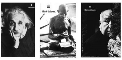
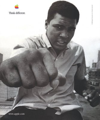
Think Different - My Favorite Ad Campaign


Apple's "Think Different" campaign is still my favorite and most memorable. I remember the first time I saw it was in a movie theater during the trailers. It was the one featuring Muhammad Ali. It was a captivating black-and-white montage of this legend who changed the sport of boxing forever. The documentary-style commercial built up to the final grammatically incorrect punch line "Think Different." It gave me goosebumps. It still does. The campaign features others like Gandhi, Einstein, and Rosa Parks who have challenged convention with radical thinking and action that have deeply changed the world forever. Leveraging the powerful feelings associated with these people and applying them to the Apple brand was ingenious and stills stand in my books as the best campaign of all time.

Wednesday, August 30, 2006

Why marketing should make the user manuals!


Lance Tracey shared this great post with me from Kathy Sierra on the Headrush Blog. She asks a very good question... why do so many companies treat potential users so much better than existing users? So much time and effort is put in to designing slick glossy brochures to attract new users, while product manuals are treated as a painful afterthought - usually black and white printing on low-grade stock. Yet, product manuals are to be used by existing users who have bought from you. You would think they would matter most and the information they need from you would be packaged accordingly. But in almost all cases, it isn't. And we wonder why users don't read the f***ing manual! I'm guilty of it myself. There is such a natural tendency by business operators and marketers to entice and capture new customers, rather than focus on their captive mass. I think 'hunting' seems sexier than 'cultivating' so we align our marketing resources as such. What would happen if it were the other way around and we placed more emphasis on our current users and treated them the same or better, not worse. You could turn them in to a highly effective viral marketing channel by engaging and helping them to become as passionate about your product as you are. You'll get the new users as a result.

So put your money where your users are if you're in it for the long haul and develop kickass support material. This isn't the place to cut corners. And as Kathy suggests, make your manuals so good and informative that they could also be used as sales brochures.

read more
Wednesday, August 23, 2006

Logo Design For Effective Branding

Some simple tips when approaching the question of how to design an effective logo. How memorable is your business? It might be your service, your products, or most importantly your company branding.The elements that go into your company's logo has a significant effect on how successful your business will be in bringing customers in and keeping them coming back.

read more | digg story

Monday, August 21, 2006

10 steps to building your web presence

A 10-step article that covers some of the most common mistakes when designing and developing a business web site. I like how it touches on the importance of the home page which should be highly functional rather than just a beautiful front cover. I like to use the analogy that a home page should be designed in the same manner as the front page of a newspaper. With a newspaper, readers can quickly glance and find the most relevant stories to them and where they are located in the paper. Similarily, a home page should share the same functionality and let the user get to the information they want fast and easy.

read more | digg story

Thursday, August 10, 2006

SES 2006: Pimp That Site!

I found this article on webpronews.com about how sites can benefit from some good fashion sense.


Most sites could benefit from a little nip and tuck, and when that can increase their search engine visibility from nil to above-the-fold in the SERPs, the impact on a site can be dramatic. Staff writer Doug Caverly of WebProNews filed this exclusive look at the SES 2006 San Jose session, Pimp My Site!

Doug also had some observations about the fashion sensibilities of the presenters. Said Doug (edited for clarity and a handful of colorfully creative metaphors):

"Herrera is wearing a fuzzy, bright orange jacket and hat with white tiger-type accents. Also some dollar-sign glasses with the price tag fluttering around. Friesen is wearing a similar outfit, but his is purple instead of orange, and somehow that's less offensive. Lloyd-Martin and Osmeloski are wearing relatively "normal" dresses with the white-and-black tiger-pattern streaks of color. Li and Laycock are dressed sanely. Bless them."

Read full article here